Context and Goals
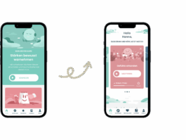
Based on a comprehensive user test conducted in 2022 for the Balloon app, we implemented a number of significant updates to improve the overall user experience. These included redesigning the Home and Discover tabs, transforming the Favorites tab into My Balloon, improving readability and contrast, and making a wider range of content beyond meditations more visible. In addition, we introduced new search and filter functions.
My Role
As lead designer, I coordinated and guided these changes throughout all phases of the process. In the following, I will highlight the redesign of the Home tab in particular.
Redesign of the Home Tab
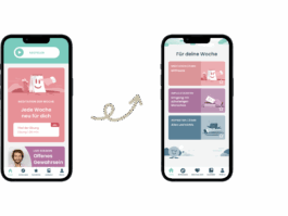
Previously, the Home tab gave users access to their last played course, the meditation of the week, the current podcast, information on the next live session, and reminder settings. Based on user feedback, we expanded this to allow access to multiple recently played meditations directly from the Home tab. To make additional content such as inspiration and weekly impulses – previously communicated mainly via newsletter – more visible, we introduced the new category For Your Week.
Interface and Navigation Adjustments
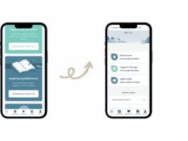
The original interface used large tiles, creating a spacious layout but also leading to long scrolling. Responding to user feedback, we made the interface leaner to reduce scrolling while preserving the immersive feeling of the Balloon world. Illustrations remained a central element to maintain a sense of visual depth.
Improving Readability and Contrast
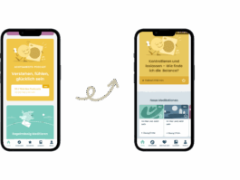
Color contrasts presented another challenge. Balloon’s pastel tones – such as green, yellow, and pink – along with darker shades like blue and violet, were chosen to convey calm and mindfulness, but they caused issues with legibility. White text on light backgrounds and dark text on dark backgrounds were difficult to read. Without fundamentally changing Balloon’s corporate design, we made targeted adjustments at the most critical points. For example, the podcast, represented by yellow, no longer uses white text, and key information such as exercise descriptions is no longer placed on colored backgrounds.
Context and Goals
Based on a comprehensive user test conducted in 2022 for the Balloon app, we implemented a number of significant updates to improve the overall user experience. These included redesigning the Home and Discover tabs, transforming the Favorites tab into My Balloon, improving readability and contrast, and making a wider range of content beyond meditations more visible. In addition, we introduced new search and filter functions.

My Role
As lead designer, I coordinated and guided these changes throughout all phases of the process. In the following, I will highlight the redesign of the Home tab in particular.

Redesign of the Home Tab
Previously, the Home tab gave users access to their last played course, the meditation of the week, the current podcast, information on the next live session, and reminder settings. Based on user feedback, we expanded this to allow access to multiple recently played meditations directly from the Home tab. To make additional content such as inspiration and weekly impulses – previously communicated mainly via newsletter – more visible, we introduced the new category For Your Week.

Interface and Navigation Adjustments
The original interface used large tiles, creating a spacious layout but also leading to long scrolling. Responding to user feedback, we made the interface leaner to reduce scrolling while preserving the immersive feeling of the Balloon world. Illustrations remained a central element to maintain a sense of visual depth.

Improving Readability and Contrast
Color contrasts presented another challenge. Balloon’s pastel tones – such as green, yellow, and pink – along with darker shades like blue and violet, were chosen to convey calm and mindfulness, but they caused issues with legibility. White text on light backgrounds and dark text on dark backgrounds were difficult to read. Without fundamentally changing Balloon’s corporate design, we made targeted adjustments at the most critical points. For example, the podcast, represented by yellow, no longer uses white text, and key information such as exercise descriptions is no longer placed on colored backgrounds.