Ruhepunkt
A digital support for inclusive and low-stimulus places.

This project was created as my final capstone for the neue fische continuing education program in UI and UX design, together with two other UI and UX designers, Alia and Maria.
Our Motivation
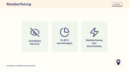
We focused on invisible barriers in everyday life – stimuli such as noise, light, or crowds, which are especially stressful for neurodivergent people. In Germany, this affects around 15–20% of the population. And when we think about constant availability and the flow of information, we realize: overstimulation is no longer a niche issue, but a problem that affects us all.
In the following, I would like to present our 4-week process with a strong focus on research but before diving into the details, here’s our final video of the app:
It follows our persona Olivia, who is planning a visit to the swimming pool. Sensitive to noise and crowds, she uses Ruhepunkt to prepare and navigate her experience. You’ll get to know her better later on – for now, enjoy a first glimpse of how the app supports her journey.
Conceptual Limitations
Since this was a concept project, we worked with a hypothetical state of the app, showing locations as if they had already been reviewed by many users. This allowed us to demonstrate the potential of Ruhepunkt. In reality, the app would depend heavily on community contributions – only through shared input could this type of data be collected and made available. Until such real data exists, we would use KPIs to validate assumptions and measure how the concept could perform.
Agenda
As we go on, I’ll share the research that shaped the project. Afterwards, I’ll take you through the development of the UX and UI design and show the results of our user testing – before closing with our key learnings.
Key Insights from Research
We conducted a survey with 88 participants, as well as 6 interviews: 3 with affected individuals and 3 with experts from the fields of inclusion management & remedial education for the autism spectrum.
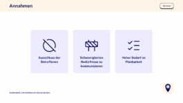
Both our desk research and our interviews/survey confirmed the following assumptions:
- People with sensory sensitivity are particularly often excluded in public spaces.
- Many have difficulties directly communicating their needs.
- There is a high need for predictability.
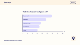
Results of our survey show that...
… while shopping, in medical practices, government offices, and public transport, people are most often excluded.
… withdrawal is the most common coping strategy.
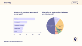
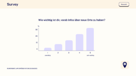
… for almost two-thirds of respondents, detailed information about new places (e.g., maps, photos, occupancy data) is important to avoid overload.
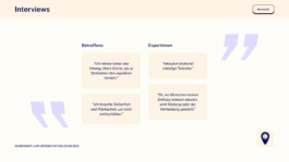
Our interviews confirmed these assumptions and highlighted just how diverse individual needs can be. More than anything, they showed that the greatest need lies in predictability and in having access to the right information.
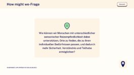
These insights led us to our "how might we question":
Meet Olivia
Based on our research, we also created a persona: Olivia. She is 22 years old and highly introverted. She is particularly sensitive to stimuli such as noise and crowds, but in moments of stress she has not yet found effective strategies to cope. She also has a strong need for safety and predictability.

Olivia's Journey
Our user journey map illustrates how Olivia experiences the app Ruhepunkt. She is planning a visit to the swimming pool and downloads the app for her preparation, feeling a bit skeptical at first. During the onboarding, she quickly notices that her individual needs are taken into account through a personalized sensitivity questionnaire. In the map view, she then discovers low-stimulus places and gains a sense of planning security thanks to the variety of available information. Finally, Olivia rates the place and feels a sense of self-efficacy, as she actively contributes to the added value of the app.

From Low to High Fidelity
Using our two most important features, I’ll now show you our process from low to high fidelity wireframing.
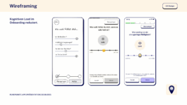
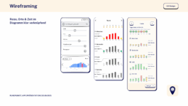
Here you can see the onboarding. Over time, we reduced the cognitive load by spreading the questions about individual sensitivities across several screens.
In our diagram, the biggest challenge was to clearly combine stimuli, places, and time. The goal was to help people like Olivia better evaluate locations in advance based on their individual needs. Step by step, we were able to make the diagram more complex while keeping it easy to understand.
From Principles to Interface
We developed our design principles based on the needs of our users:

Guided by these principles, we began developing the UI – starting with typography.
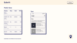
We chose the typeface Public Sans – neutral, objective, with clearly distinguishable letters, good for neurodivergent users.
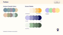
Our color scheme is based on autism-friendly palettes. Because these are often low-contrast, we added sufficient but not overwhelming contrasts, plus a traffic light system for quick orientation.
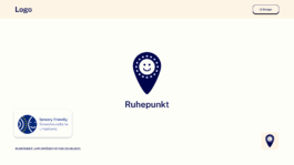
The logo combines a smiley and a pin, inspired by the “Sensory Friendly” badge of the Luna Association Leipzig, directly pointing to finding sensory-friendly places.
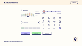
For our user interface design, we followed the Neurodiversity Design System, making elements like buttons intentionally clear and tactilely clickable. Our icons and pictograms are minimalist and easy to understand. The smileys complement the traffic light color system to make levels easier to grasp.
User Testing
We then tested our prototype with two very different perspectives – one highly sensory-sensitive, neurodivergent person, and one sensory-sensitive introvert.
In the place view, we replaced the simplified mood badges with a more informative diagram. Instead of only showing whether a location currently fits, the diagram now visualizes the stimulus intensity throughout the day. This way, users can interpret the data themselves and filter the information according to their own needs.

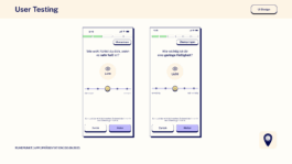
In interactions and wording, the original emotion-based rating system was particularly difficult for people on the spectrum. We now phrase questions and answers more neutrally and inclusively.
Looking back
The most valuable part of this project was the collaboration itself. A big thank you to neue fische for creating the framework and to my teammates Maria and Alia – we complemented each other perfectly and learned so much from working together. This capstone showed us how important inclusivity, transparency, and sensitivity are in both language and design, and how powerful it can be to approach challenges as a team.
Ruhepunkt
A digital support for inclusive and low-stimulus places.

This project was created as my final capstone for the neue fische continuing education program in UI and UX design, together with two other UI and UX designers, Alia and Maria.
Our Motivation
We focused on invisible barriers in everyday life – stimuli such as noise, light, or crowds, which are especially stressful for neurodivergent people. In Germany, this affects around 15–20% of the population. And when we think about constant availability and the flow of information, we realize: overstimulation is no longer a niche issue, but a problem that affects us all.

In the following, I would like to present our 4-week process with a strong focus on research but before diving into the details, here’s our final video of the app:
It follows our persona Olivia, who is planning a visit to the swimming pool. Sensitive to noise and crowds, she uses Ruhepunkt to prepare and navigate her experience. You’ll get to know her better later on – for now, enjoy a first glimpse of how the app supports her journey.
Conceptual Limitations
Since this was a concept project, we worked with a hypothetical state of the app, showing locations as if they had already been reviewed by many users. This allowed us to demonstrate the potential of Ruhepunkt. In reality, the app would depend heavily on community contributions – only through shared input could this type of data be collected and made available. Until such real data exists, we would use KPIs to validate assumptions and measure how the concept could perform.
Agenda
As we go on, I’ll share the research that shaped the project. Afterwards, I’ll take you through the development of the UX and UI design and show the results of our user testing – before closing with our key learnings.
Key Insights from Research
We conducted a survey with 88 participants, as well as 6 interviews: 3 with affected individuals and 3 with experts from the fields of inclusion management & remedial education for the autism spectrum.
Both our desk research and our interviews/survey confirmed the following assumptions:
- People with sensory sensitivity are particularly often excluded in public spaces.
- Many have difficulties directly communicating their needs.
- There is a high need for predictability.

Results of our survey show that...
… while shopping, in medical practices, government offices, and public transport, people are most often excluded.

… withdrawal is the most common coping strategy.

… for almost two-thirds of respondents, detailed information about new places (e.g., maps, photos, occupancy data) is important to avoid overload.

Our interviews confirmed these assumptions and highlighted just how diverse individual needs can be. More than anything, they showed that the greatest need lies in predictability and in having access to the right information.

These insights led us to our "how might we question":

Meet Olivia
Based on our research, we also created a persona: Olivia. She is 22 years old and highly introverted. She is particularly sensitive to stimuli such as noise and crowds, but in moments of stress she has not yet found effective strategies to cope. She also has a strong need for safety and predictability.

Olivia's Journey
Our user journey map illustrates how Olivia experiences the app Ruhepunkt. She is planning a visit to the swimming pool and downloads the app for her preparation, feeling a bit skeptical at first. During the onboarding, she quickly notices that her individual needs are taken into account through a personalized sensitivity questionnaire. In the map view, she then discovers low-stimulus places and gains a sense of planning security thanks to the variety of available information. Finally, Olivia rates the place and feels a sense of self-efficacy, as she actively contributes to the added value of the app.

From Low to High Fidelity
Using our two most important features, I’ll now show you our process from low to high fidelity wireframing.
Here you can see the onboarding. Over time, we reduced the cognitive load by spreading the questions about individual sensitivities across several screens.

In our diagram, the biggest challenge was to clearly combine stimuli, places, and time. The goal was to help people like Olivia better evaluate locations in advance based on their individual needs. Step by step, we were able to make the diagram more complex while keeping it easy to understand.

From Principles to Interface
We developed our design principles based on the needs of our users:

Guided by these principles, we began developing the UI – starting with typography.
We chose the typeface Public Sans – neutral, objective, with clearly distinguishable letters, good for neurodivergent users.

Our color scheme is based on autism-friendly palettes. Because these are often low-contrast, we added sufficient but not overwhelming contrasts, plus a traffic light system for quick orientation.

The logo combines a smiley and a pin, inspired by the “Sensory Friendly” badge of the Luna Association Leipzig, directly pointing to finding sensory-friendly places.

For our user interface design, we followed the Neurodiversity Design System, making elements like buttons intentionally clear and tactilely clickable. Our icons and pictograms are minimalist and easy to understand. The smileys complement the traffic light color system to make levels easier to grasp.

User Testing
We then tested our prototype with two very different perspectives – one highly sensory-sensitive, neurodivergent person, and one sensory-sensitive introvert.
In the place view, we replaced the simplified mood badges with a more informative diagram. Instead of only showing whether a location currently fits, the diagram now visualizes the stimulus intensity throughout the day. This way, users can interpret the data themselves and filter the information according to their own needs.

In interactions and wording, the original emotion-based rating system was particularly difficult for people on the spectrum. We now phrase questions and answers more neutrally and inclusively.

Looking back
The most valuable part of this project was the collaboration itself. A big thank you to neue fische for creating the framework and to my teammates Maria and Alia – we complemented each other perfectly and learned so much from working together. This capstone showed us how important inclusivity, transparency, and sensitivity are in both language and design, and how powerful it can be to approach challenges as a team.